Access for All Guidance note 11: External environment
Problems of access for disabled people and people with limited mobility often begin outside the building. A poorly designed and maintained external environment can place just as many obstacles in the way of access as can an inadequate building.
Further guidance on approaches to buildings can be found in Design Note No 1 – Approaches and entrances. Accessible routes should be provided, from the edge of the site of the building, and from any parking spaces within the site of the building and dedicated for use by the disabled, to the principal entrance of the building (or alternative entrance if appropriate). Further guidance on external ramps, external stairways, and hazard warning surfaces for external stairways can be found in Design Note No 1 – Approaches and entrances.
- Minor changes in level should be accommodated by ramps not steps. Guidance on major changes of level is given further on.
- Pavements and footpaths should have an unobstructed width of at least
1200mm. - Edges of pavements and footpaths should be defined by the use of a change in texture, or a kerb or gully incorporating a colour contrast.
- Kerbs should be dropped to road level at access and crossing points. The maximum gradient of drop should be 1:12, with a minimum width of 1400mm.
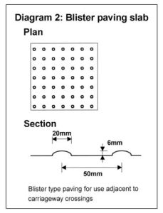
- The crossing should be identified by a blister type tactile surface for people with impaired sight. Diagram 1 shows a typical layout, and diagram 2 shows suitable profile. The pattern should be at right angles to the crossing.


- The provision of suitable seating adjacent to the route can be advantageous for people with mobility difficulties, particularly where travel distance is great. Seats should have backs and arm rests, with the seat between 450 and 500mm from ground level.
- Pavements, steps and ramps should be non-slip. Where joints are necessary, they should be level.
- Pavements and footpaths should be adequately maintained.
- Block pavers with pronounced bevel edges should be avoided.
- Street furniture should be visually distinguishable from its surroundings.
- On pavements, items of street furniture should be grouped together and placed near the outside edge, as groups of obstacles are more easily identified by blind or partially sighted people.
- Street furniture should be identifiable at ground level by long cane users, who will determine the existence and width of an obstruction by sweeping the long cane tip from side to side on the ground.
- Display boards should not be placed on the public highway; they are a danger to many disabled people, to older people, and to people pushing buggies.
- Gratings should be of a type that will not trap the wheels of wheelchairs or buggies.
- Protecting shopfront signs should have at least 2100mm clearance under them.
Hazard warning surfaces
Tactile hazard warnings should be provided for people with impaired vision
- Blister paving (see Diagram 2) at pedestrian crossings (see Diagram 1).
- Tactile paving (cobbles) where windows or doors opening over paths are unavoidable.
- Corduroy paving to stairways (see Design Note No 1 – Approaches and entrances for guidance).
Where major changes in level are unavoidable, both ramped and stepped routes should be provided, as some people who do not use a wheelchair have difficulty walking on sloping surfaces. Routes should be signposted where they are not readily apparent.
Guidance on external ramps and external stairways is given in Design Note No 1 – Approaches and entrances.

